Ribbon Elements (Controls)
 BCGControlBar Pro (MFC)
 BCGSuite (MFC)
BCGControlBar for .NET
The library comes with the following set of Microsoft Office-style ribbon controls ready to use.
- Button
- Button with Menu (Split Button)
- Buttons Group
- Text Label
- Separator
- Edit Box
- Combo Box
- Checkbox
- Radio Button
- Color Picker
- Font Picker
- Palette (Image List, Gallery)
- Quick Steps
- Undo button
- Hyperlink
- Slider
- Switch
- Progress Bar
Most of the ribbon controls should have two images: small and large. In some cases, when a ribbon control is stretched to a size that allows it to display an image, but no specific image has been provided, the library will use the default internal image.
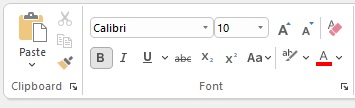
Buttons, Groups, Combobox and Font Picker:
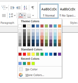
Color picker with custom palette:
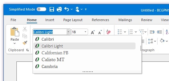
Font Picker with text preview:
Sample code:
// Create ribbon button with menu:
CBCGPRibbonButton* pBtnPaste = new CBCGPRibbonButton (ID_EDIT_PASTE, _T("Paste"), 0, 0);
pBtnPaste->SetMenu (IDR_PASTE_MENU, TRUE);
pPanelClipboard->Add (pBtnPaste);

// Create simple ribbon buttons:
pPanelClipboard->Add (new CBCGPRibbonButton (ID_EDIT_CUT, _T("Cut"), 1));
pPanelClipboard->Add (new CBCGPRibbonButton (ID_EDIT_COPY, _T("Copy"), 2));
pPanelClipboard->Add (new CBCGPRibbonButton (ID_EDIT_FORMAT, _T("Format"), 3));

// Create font picker:
CBCGPRibbonFontComboBox* pFontCombo = new CBCGPRibbonFontComboBox (ID_FONT_FONT);
pFontGroup->AddButton (pFontCombo);

// Create color picker:
CBCGPRibbonColorButton* pColorBtn = new CBCGPRibbonColorButton ();
pColorBtn->EnableOtherButton (_T("Other..."));
pColorBtn->SetColor (RGB (240, 240, 240));

pPanelParagraph->Add (pColorBtn);