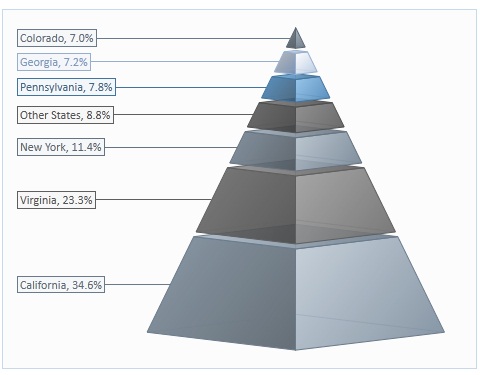
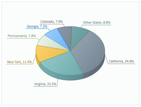
Chart Data Labels
 BCGControlBar Pro (MFC)
BCGSuite (MFC)
 BCGControlBar for .NET
Data label formatting includes the following customizable elements:
- Visibility
- Fill color
- Line color, width, and stroke style
- Text color, font size, and rotation
- Data label position. For some series types (columns, bars, and pies). it's limited by the following options:
- Outside
- Inside end
- Inside Base
- Center
For the rest of the series types, the data label position is defined by an angle and distance from data marker.
- Drop a line at the data marker. If this option is on, the data label's box is connected with a data marker by a line.
- Underline data label. If this option is on, the data label's border is not drawn, but the data label's text is underlined, and this line is connected with a data marker.
- Draw a data label border. If this option is turned off, the border around data label content is not drawn and the bounding rectangle is not filled.
- Include a legend key in the label. If this option is on, the data label displays the series legend key.
- Data label content. You can customize it to display the following information (or a combination of any relevant parts):
- Series Name
- Category Name
- Value (Y value)
- Percentage (useful for a pie series)
- X Value (useful for any series where the X component is set to a value other than index or category)
- Bubble size (for bubble series)
- Data label content separator. You can specify any string to separate the above specified content values.
- Automatic word wrap. If this option is on, the content of the data label will be automatically wrapped to fit the specified data label rectangle.
- Custom data format. You can specify a custom format string to customize the appearance of content values.
Data label formatting can be applied to a whole series or to each data point individually.