Circular Progress Indicator
 BCGControlBar Pro (MFC)
BCGSuite (MFC)
 BCGControlBar for .NET
This gauge implements a circular progress control functionality and has the following features:
- The gauge can be created either as "standard" (with percentage) or "marquee" (infinite) mode.
- The gauge offers a variety of progress shapes, including arcs, circles, lines, and pies.
- The gauge also features the ability to display percentage values and custom text labels.
- The gauge has the capability to display the progress indicator in addition to standard controls like a push button or tab.
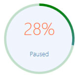
Circular progress control with custom colors and text label.
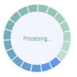
Circular progress with "pie" shapes in "marquee" mode.
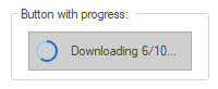
Push button with circular progress indicator.
Sample code:
// Member variable associated with a static control:
CBCGPCircularProgressIndicatorCtrl m_wndProgress;
...
m_wndProgress.SetRange(0, 100);
m_wndProgress.SetPos(25);

m_wndProgress.GetCircularProgressIndicator()->SetLabel(_T("Loading..."));