Ribbon Elements (Controls)
 BCGControlBar Pro (MFC)
 BCGSuite (MFC)
BCGControlBar for .NET
The library comes with the following set of Microsoft Office-style ribbon controls ready to use.
- Button
- Button with Menu (Split Button)
- Buttons Group
- Text Label
- Separator
- Edit Box
- Combo Box
- Checkbox
- Radio Button
- Color Picker
- Font Picker
- Palette (Image List, Gallery)
- Quick Steps
- Undo button
- Hyperlink
- Slider
- Switch
- Progress Bar
- User Account Control
Most of the ribbon controls should have two images: small (16×16) and large (32×32). In some cases, when a ribbon control is stretched to a size that allows it to display an image, but no specific image has been provided, the library will use the default internal image. In addition, the developer can specify the medium-size icon (20×20) displayed in the ribbon simplified mode.
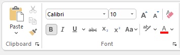
Buttons, Groups, Combobox and Font Picker:
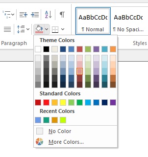
Color picker with custom palette:
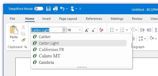
Font Picker with text preview:
Sample code:
// Create ribbon button with menu:
CBCGPRibbonButton* pBtnPaste = new CBCGPRibbonButton (ID_EDIT_PASTE, _T("Paste"), 0, 0);
pBtnPaste->SetMenu (IDR_PASTE_MENU, TRUE);
pPanelClipboard->Add (pBtnPaste);

// Create simple ribbon buttons:
pPanelClipboard->Add (new CBCGPRibbonButton (ID_EDIT_CUT, _T("Cut"), 1));
pPanelClipboard->Add (new CBCGPRibbonButton (ID_EDIT_COPY, _T("Copy"), 2));
pPanelClipboard->Add (new CBCGPRibbonButton (ID_EDIT_FORMAT, _T("Format"), 3));

// Create font picker:
CBCGPRibbonFontComboBox* pFontCombo = new CBCGPRibbonFontComboBox (ID_FONT_FONT);
pFontGroup->AddButton (pFontCombo);

// Create color picker:
CBCGPRibbonColorButton* pColorBtn = new CBCGPRibbonColorButton ();
pColorBtn->EnableOtherButton (_T("Other..."));
pColorBtn->SetColor (RGB (240, 240, 240));

pPanelParagraph->Add (pColorBtn);