Basic XML File Format
To create a new Property Grid, you should first prepare an empty XML file with the following XML code:
<?xml version="1.0" encoding="UTF-16"?>
<Properties>
</Properties>
Save this file with any name (e.g. test) and .xml extension, then import this XML file to the Property Grid.
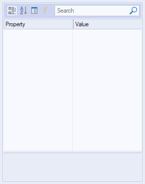
After you have imported empty XML file, you will see empty property grid:
Add Properties to the Property Grid XML
Property Grid has a specific set of properties that are defined by elements in the XML code. Each property has a set of attributes that are responsible for the various parameters of this property. There are attributes that are common for all properties, as well as specific attributes (valid only for a single property). Let's take a look at the list of attributes common for all properties.
List of Common Attributes (Can be used for All Properties)
- name (required) - name of the property. Format is "normal string" (string without TAB, CR and LF spaces).
- id - id of the property in "unsigned int" format. id is a unique identifier of the property allowing to distinguish it from other properties.
- description - description of the property. It is in "normal string" format and is visible at the bottom of property grid when this property is selected.
- style - this attribute allows to make a property read-only or disabled for a user. Can take the following values:
- readonly - user can view or copy the value.
- disable - the value is greyed-out, user can view or copy the value.
- hidden - specifies whether the property is hidden.
If "style" attribute is not specified in XML code, then property value is available for editing by user.
- textColor - specifies the property value foreground color. You can set up any custom value in HEX format from "ffffff" (white) to "000000" (black) for this attribute.
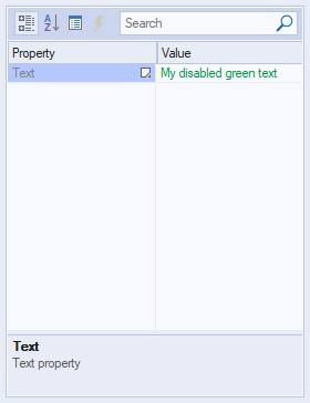
Example of using common attributes in XML code for <string> property:
<?xml version="1.0" encoding="UTF-16"?>
<Properties>
    <string
        id="1"
        name="Text"
        description="Text property"
        style="disabled"
        textColor="009A44">
        My disabled green text
    </string>
</Properties>
Result:
<g> Property (Group of Properties)
<g> element is used to create the group of properties designed as hierarchical structure.
To create a structured group, add the following code to the xml file (highlighted in bold):
<?xml version="1.0" encoding="UTF-16"?>
<Properties>
    <g
        name="Group"
        description="New Test Group"
        collapsed="false">
    </g>
</Properties>
Result:
-1.png)
As a result, you will see created group in the grid (see the image above) but it cannot be expanded because this group has no properties to expand (you should add them between <g> and </g> tags).
Attributes specific for <g> property:
- hasCheckBox - format is Boolean. If hasCheckBox="true", then group will have a checkbox before its name. If unchecked, this check box will make the group properties disabled (greyed-out).
XML code example for the group containing 2 <number> properties and "hasCheckBox" attribute:
<?xml version="1.0" encoding="UTF-16"?>
<Properties>
    <g name="Group with checkbox"
    hasCheckBox="true">
        <number
            name="Subitem 1"
            description="1-st subitem"
            type="long">1
        </number>
        <number
            name="Subitem 2"
            description="2-nd subitem"
            type="long">2
        </number>
    </g>
</Properties>
This example uses <number> element, see their description below.
Result:
-2.png)
<options> Property
<options> element is used to create a drop-down options list. To create an empty options list you should use <options> and </options> tags and common attributes.
Attributes specific for <options> property:
- editable - format is "Boolean". If editable="true," then the user can type any text in the edit box; by default, or if this attribute is "false," the edit box is read-only, and the property can be modified only by choosing an option from the drop-down list.
- autoComplete - format is "Boolean". When the user types text with autoComplete="true" and editable="true," the matching option from the drop-down list automatically fills the edit box.
<option> Property
To create a drop-down options list, you should put <option> elements inside of the <options> and </options> tags.
XML code format:
<?xml version="1.0" encoding="UTF-16"?>
<Properties>
    <options
        name="Option group name"
        description="Option group description"
        style="readonly">
        <option selected="true">
        Option 1</option>
        <option>Option 2</option>
        <option>Option 3</option>
        <option>Option 4</option>
    </options>
</Properties>
Result:
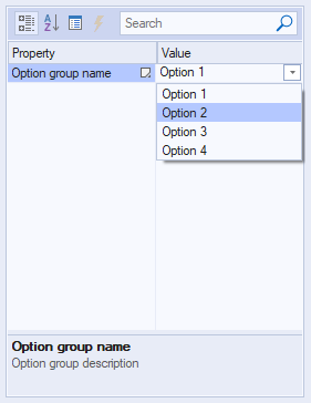
Attributes specific for <option> property:
- selected - format is "Boolean". If selected="true" then options with this attribute will be selected in the options list. If this attribute is not specified for any of the options, nothing will be selected.
<boolean> Property
<boolean> element is used to set property with Boolean values ("true" or "false").
XML code format:
<?xml version="1.0" encoding="UTF-16"?>
<Properties>
    <boolean name="Boolean 1"
        description=
            "Property with TRUE/FALSE values"
        style="readonly">false</boolean>
</Properties>
Result:
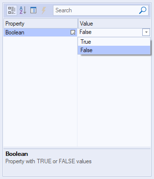
Attributes specific for <boolean> property:
- "true" or "false" value specified between <boolean> and </boolean> tags is designed to define the selected value of the property ("true" or "false"). If nothing is specified, then "false" value will be selected.
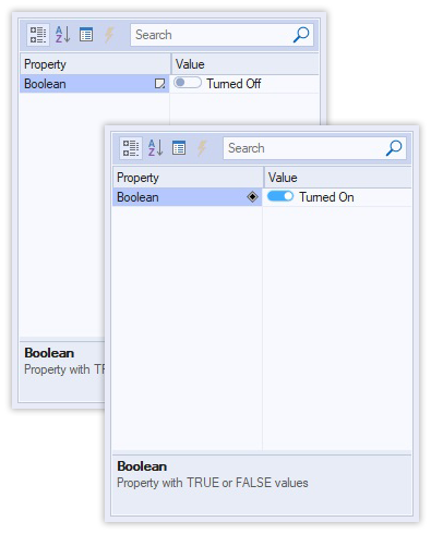
- switchOn and switchOff attributes are designed to specify captions for "toggle switch" BOOL style. These attributes are optional. If not specified, then toggle switch is displayed without captions.
XML code example with switchOn and switchOff attributes:
<?xml version="1.0" encoding="UTF-16"?>
<Properties>
    <boolean name="Boolean"
        description=
            "Property with TRUE/FALSE values"
        switchOn="Turned On"
        switchOff="Turned Off">false
    </boolean>
</Properties>
Result:
<string> Property
<string>
element is designed to set property with text values (read-only and editable text fields).
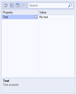
There is the simplest example of XML code for single-line editable text string:
<?xml version="1.0" encoding="UTF-16"?>
<Properties>
    <string name="Text"
    description="Text property">My text
    </string>
</Properties>
Result:
Attributes specific for <string> property:
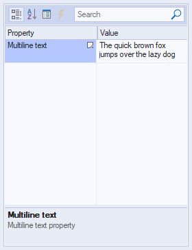
- textRows - it is specified for multi-line strings and contains number of lines (e.g. 2).
Example of using "textRows" attribute in XML code:
<?xml version="1.0" encoding="UTF-16"?>
<Properties>
    <string name="Multiline text"
        description="Multiline text property"
        textRows="2">
        The quick brown fox jumps over
        the lazy dog
    </string>
</Properties>
Result:
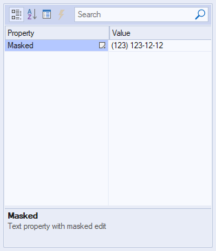
- editMask and editTemplate attributes are specified for editable lines where user should input data according to pre-defined mask / layout. editMask attribute allows to specify what type of chars user can write and where in the string. E.g. editMask="DDD aaa aa aa" means that the first 3 symbols can be only digits, and the rest symbols can be alphanumeric or spaces. editTemplate attribute value should have the same length as editMask attribute value. "_" symbols in editTemplate value can be used only as placeholders for characters, other symbols (letters, ":", "-") are not editable and will be displayed "as is".
Example of using "editMask" and "editTemplate" attributes in XML code:
<?xml version="1.0" encoding="UTF-16"?>
<Properties>
    <string name="Masked"
        description=
        "Text property with masked edit"
        editMask="(ddd) ddd dd dd"
        editTemplate="(___) ___-__-__">
        (123) 123-12-12
    </string>
</Properties>
Result:
- editValidChars - use this attribute to define a list of valid characters that can be used for string property. If an entered character is not in this list, then masked edit control will not accept it. If editValidChars attribute is not specified or is NULL, it means that all possible characters are valid.
<date> Property
<date> element is designed to set property with date and time values.
XML code format:
<?xml version="1.0" encoding="UTF-16"?>
<Properties>
    <date
        name="Date"
        description="Date property"
        displayDate="true">
        05/20/2021
    </date>
</Properties>
Result:
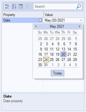
Attributes specific for <date> property:
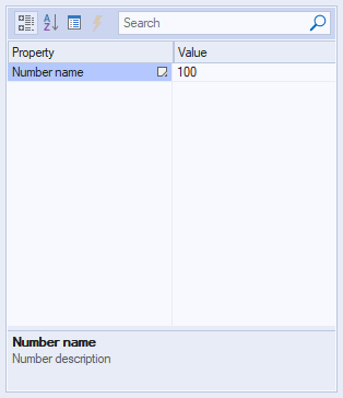
<number> Property
<number>
element is designed to set property with numeric values of specified type (read-only and editable numeric fields).
XML code format:
<?xml version="1.0" encoding="UTF-16"?>
<Properties>
    <number
        name="Number name"
        description="Number description"
        type="long">
        100
    </number>
</Properties>
Result:
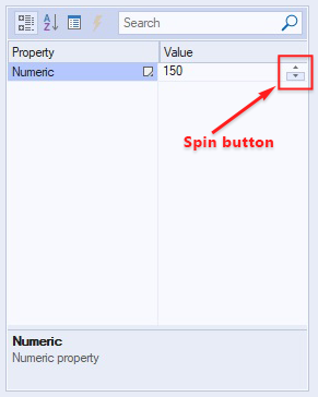
Attributes specific for <number> property:
- minValue and maxValue - these attributes are necessary if you want to create numeric field with spin button. So, if you specify minValue="0" and maxValue="1000", then you can spin numbers from 0 to 1000 by arrows in number property value field.
Example of XML code with "minValue" and "maxValue" attributes:
<?xml version="1.0" encoding="UTF-16"?>
<Properties>
    <number
        name="Numeric"
        description="Numeric property"
        minValue="0"
        maxValue="1000"
        type="long">
        150
    </number>
</Properties>
Result:
- type - the type of numeric data. This attribute can take the following values: "short", "long", "longlong", "byte", "float", "double", "unsigned short", "unsigned long", "unsigned longlong".
<color> Property
<color> element is designed to set property with color values that can be specified by numeric color codes as well as selected from visual color table.
XML code format:
<?xml version="1.0" encoding="UTF-16"?>
<Properties>
    <color
        name="Color"
        description="Color property"
        type="long"
        automaticLabel="Default Color"
        automatic="000000"
        otherButton="More Colors">
        666677
    </color>
</Properties>
Result:
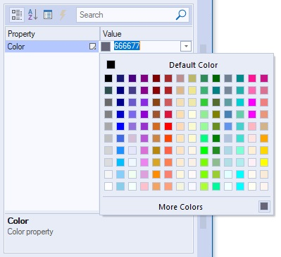
Attributes specific for <color> property:
- otherButton - this attribute defines name of the button at the bottom of colors drop-down that brings up window with custom colors.
- automatic - this attribute defines color code value (in HEX format) of the default color at the top of colors drop-down window.
- automaticLabel - this attribute defines name of the button for default color (see "automatic" attribute).
- The value specified between <color> and </color> tags - defines color code value (in HEX format) for color located next to the bottom button defined by otherButton attribute.
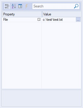
<file> Property
<file> element is designed to set property with ability to specify file path value that can be typed manually as well as selected from file dialog, which is invoked by clicking "..." button in property value field.
XML code format:
<?xml version="1.0" encoding="UTF-16"?>
<Properties>
    <file
        name="File"
        description="File property"
        defExt="txt"
        filter=
        "Text Files (*.txt)|*.txt|
        All Files (*.*)|*.*||"
        themedDlg="true">
        c:\test\test.txt
    </file>
</Properties>
Result:
Attributes specific for <file> property:
- defExt - this attribute is designed to define file extension that will be used in file explorer for displaying file list.
- saveFileDlg - this Boolean attribute specifies whether the invoked file dialog is an "Open File" dialog (if FALSE) or "Save File" dialog.
XML code example with saveFileDlg attribute:
<?xml version="1.0" encoding="UTF-16"?>
<Properties>
    <file
        name="File"
        description="File property"
        defExt="txt"
        filter=
        "Text Files (*.txt)|*.txt|
        All Files (*.*)|*.*||"
        themedDlg="true"
        saveFileDlg="true">
    </file>
</Properties>
Result:
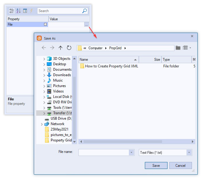
- filter - this attribute defines the filter of files that will be displayed in the invoked file dialog (by name and extension). You can use *.* to show all files or *.txt to show only .txt files.
- themedDlg - this Boolean attribute specifies whether the invoked file dialog is themed or not. If it is "true", the file dialog will be invoked using colors and design of the selected theme.
- You can specify value between
and
tags, and this value will be used for the property value field.
<folder> Property
<folder> element is designed to set property with ability to specify folder path value that can be typed manually as well as selected from folder tree-view dialog, which is invoked by clicking "..." button in property value field.
XML code format:
<?xml version="1.0" encoding="UTF-16"?>
<Properties>
    <folder
        name="Folder"
        description="Folder property"
        themedDlg="true">
        c:\
    </folder>
</Properties>
Result:
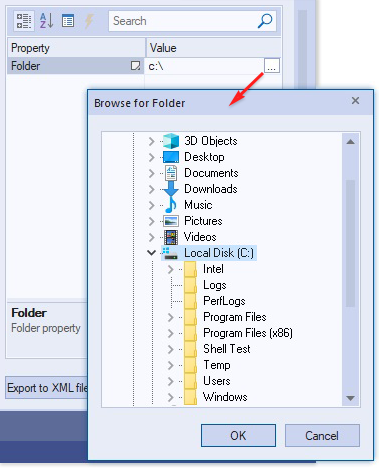
Attributes specific for <folder> property:
- themedDlg - this Boolean attribute specifies whether the invoked folder tree-view dialog is themed or not. If it is "true", the file dialog will be opened with using colors and design of the selected theme.
- You can specify value between <folder> and </folder> tags, and this value will be used for the folder property value field.
<bitwise> Property
<bitwise> element is designed to set bitwise property. Use this type of property if you need to specify some object flags such as window style(s).
To define combination of "true" and "false" values for each flag, you should specify value between <bitwise> and </bitwise> tags in XML code. For example, you have 5 flags in bitwise property and want Flag 1, Flag 2 and Flag 4 to be "true" (1), Flag 3 and Flag 5 to be "false" (0). So, you should use binary value 01011 and convert it into decimal value (11). Then put 11 between <bitwise> and </bitwise> tags to get the desired result:
XML code format:
<?xml version="1.0" encoding="UTF-16"?>
<Properties>
    <bitwise
        name="Flags"
        description="Bitwise property"
        valuesList="true"
        collapsed="true"
        type="long"
        flags=
        "Flag 1;Flag 2;Flag 3;Flag 4;Flag 5"
        flagDescriptions=
        "1-st flag description;
        2-nd flag description;
        3-rd flag description;
        4-th flag description;
        5-th flag description">
        11
    </bitwise>
</Properties>
Note: if no value has been specified between <bitwise> and </bitwise> tags, then all flags will be FALSE.
Result:
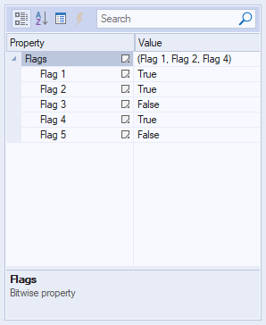
Attributes specific for <bitwise> property:
- flags - specifies list of flag names separated by semicolon (;).
- flagDescriptions - specified list of descriptions for each flag separated by semicolon (;).
<brush> Property
<brush> element is designed to set brush-based property.
XML code format:
<?xml version="1.0" encoding="UTF-16"?>
<Properties>
    <brush
        name="Brush"
        description="Brush property"
        gradientType="12"
        color="0, 114, 206"
        colorGradient="239, 51, 64"
        opacity="0.75">
        Brush
    </brush>
</Properties>
Result:
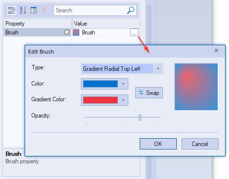
Attributes specific for <brush> property:
- gradientType - this attribute is in numeric format and specifies gradient type of brush property. Gradient type depends on specified value. You can get the full list of values at BCGControlBar Pro for MFC: CBCGPBrush::BCGP_GRADIENT_TYPE.
- color - this attribute specifies basic color of the brush property. This attribute should be specified in RGB format from "0, 0, 0" to "255, 255, 255".
- colorGradient - this attribute specifies gradient color of the brush property. This attribute should be specified in RGB format from "0, 0, 0" to "255, 255, 255".
- opacity - this attribute defines opacity of the brush (from transparent to fully opaque). The value of this attribute should be specified in float format from "0" to "1" (e.g. "0.75").
<lineStyle> Property
<lineStyle> element is designed to set line style property. Use this type of property if you need to implement lines with ability to select style of these lines (solid line, dashed or dotted line, etc.) from the drop-down list.
XML code format:
<?xml version="1.0" encoding="UTF-16"?>
<Properties>
    <lineStyle
        name="Line Style"
        description="Line style property"
        type="long"
        style="readonly">
        3
    </lineStyle>
</Properties>
Result:
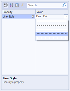
Attributes specific for <lineStyle> property:
- You can specify numeric (integer) value between <lineStyle> and </lineStyle> tags, and this value will be used for the property value field. You can use values from 0 to 4:
- 0 - Solid line.
- 1 - Dashed line.
- 2 - Dotted line.
- 3 - Dash Dot.
- 4 - Dash Dot Dot.
<textFormat> Property
<textFormat> element is designed to set format (font family, size, style, alignment, etc.) of text.
XML code format:
<?xml version="1.0" encoding="UTF-16"?>
<Properties>
    <textformat
        name="Text format"
        description="Text format prop"
        fontFamily="Arial"
        fontSize="-11"
        fontWeight="300"
        fontStyle="oblique"
        fontLocale="en-US"
        textAlignment="0"
        textVertAlignment="1"
        underline="true"
        strikethrough="true">
        Arial(8)
    </textformat>
</Properties>
Result:
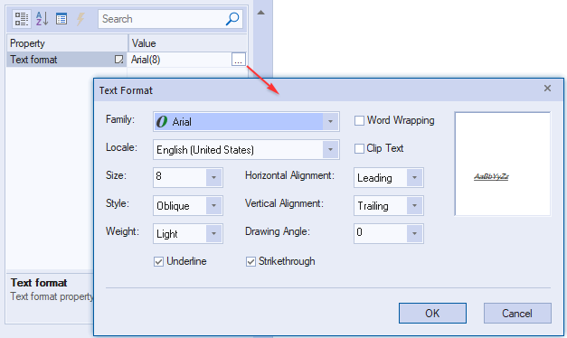
Attributes specific for <textFormat> property:
- fontFamily - specifies the font family for the text format property. E.g. "Arial", "Times New Roman", "Calibri", etc.
- fontSize - specifies the font size for the text format property. Values are the same as in MS LOGFONT structure.
- fontWeight - specifies the font weight for the text format property. Values are the same as in MS LOGFONT structure:
| Value |
Font weight |
| "0" |
Default |
| "100" |
Thin |
| "200" |
Extra Light |
| "300" |
Light |
| "400" |
Normal |
| "500" |
Medium |
| "600" |
Semi bold |
| "700" |
Bold |
| "800" |
Extra bold |
| "900" |
Black |
| "1000" |
ExtraBlack |
- fontStyle - defines what incline the font should have. Can take the following values: "normal", "oblique", "italic".
- fontLocale - defines the locale of the text format property. E.g. "en-US" for USA or "en-GB" for the United Kingdom.
- textAlignment - defines the horizontal alignment for the text format property. "0" value specified in XML code for textAlignment attribute corresponds to leading horizontal alignment, "1" - to trailing horizontal alignment, "2" - to center horizontal alignment.
- textVertAlignment - defines the vertical alignment for the text format property. "0" value specified in XML code for textVertAlignment attribute corresponds to leading vertical alignment, "1" - to trailing vertical alignment, "2" - to center vertical alignment.
- wordWrap - this Boolean attribute defines whether text will be wrapped or not. If wordWrap="true", then "Word Wrapping" check box will be checked for this property.
- clipText - this Boolean attribute defines whether the text getting out the bounds will be clipped or not. Set clipText="true" if you want such text to be clipped.
- underline - this Boolean attribute defines whether the text will be underlined or not. Set underline="true" if you want such text to be underlined.
- strikethrough - this Boolean attribute defines whether the text will be stroked through or not. Set strikethrough="true" if you want such text to be stroked through.
<font> Property
<font> element is designed to configure the font property (set font family, size, style, effects and color).
XML code format:
<?xml version="1.0" encoding="UTF-16"?>
<Properties>
    <font
        name="Font"
        description="Font property"
        style="readonly"
        themedDlg="true"
        fontHeight="-11"
        fontWeight="400"
        faceName="Arial">
        Arial(8)
    </font>
</Properties>
Result:
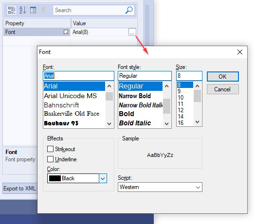
Attributes specific for <font> property:
- faceName - specifies the font family for the font property. E.g. "Arial", "Times New Roman", "Calibri", etc.
- fontHeight - specifies the font size for the font property. Values are the same as in MS LOGFONT structure.
- fontWeight - specifies the font weight for the text format property. Values are the same as in MS LOGFONT structure:
| Value |
Font weight |
| "0" |
Default |
| "100" |
Thin |
| "200" |
Extra Light |
| "300" |
Light |
| "400" |
Normal |
| "500" |
Medium |
| "600" |
Semi bold |
| "700" |
Bold |
| "800" |
Extra bold |
| "900" |
Black |
| "1000" |
ExtraBlack |
- fontItalic - this Boolean attribute defines whether the text will be italic or not. Set fontItalic="true" if you want such text to be italic.
- fontUnderline - this Boolean attribute defines whether the text will be underlined or not. Set fontUnderline="true" if you want such text to be underlined.
- fontStrikeOut - this Boolean attribute defines whether the text will be stroked through or not. Set fontStrikeOut="true" if you want such text to be stroked through.
- fontColor - specifies the font color for the font property. You can set up any custom value in HEX format from "ffffff" (white) to "000000" (black) for this attribute.
- charset - this numeric attribute defines selected script for the font. Set of values for this attribute is the same as LOGFONT::lfCharSet . For example, if you specify charSet="161" in the XML code, you will see "Greek" script selected in the "Font" dialog.
- themedDlg - this Boolean attribute specifies whether the invoked font dialog is themed or not. If it is "true", the font dialog will be invoked using colors and design of the selected theme.
<colorList> Property
<colorList> element is designed to set property with color values that can be specified by numeric color codes as well as selected from drop-down list.
XML code format:
<?xml version="1.0" encoding="UTF-16"?>
<Properties>
    <colorList
        name="Color"
        description="Color List property"
        contentType="accent"/>
</Properties>
Result:
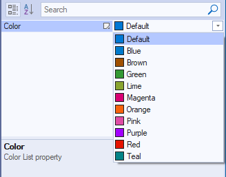
Attributes specific for <colorList> property:
- contentType - specifies which colors will be added to the list:
- StandardColors (default).
- SystemColors.
- AccentColors.
- CustomColors.
- defaultColor - specifies whether default color should be added (AccentColors only).
- noneColor - specifies 'No color' text label.
Add Commands to Your Property Grid
Using <commands> element, you can create command area in the property grid that can contain commands specified inside of <commands> and </commands> tags.
XML code format:
<?xml version="1.0" encoding="UTF-16"?>
<Properties>
    <commands rows="1">
        <command>Command 1</command>
        <command>Command 2</command>
        <command>Command 3</command>
    </commands>
</Properties>
Result:
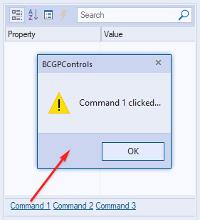
Attributes:
- rows - this attribute specifies size (height) of the area where commands will be located. E.g. if rows="1", then commands will fit in one line, if rows="2" - in two lines, etc. This attribute can be useful if you want to have a lot of commands or commands with long names, which do not fit into the one row. You should simply specify rows attribute value >1 in the XML code to expand your command area.