The BCGControlBar Library framework allows you to create various application "skins" and easily change the look and feel of user-interface elements.
Although the product has more than 25 pre-built visual themes, you can easily implement your custom theme(s).
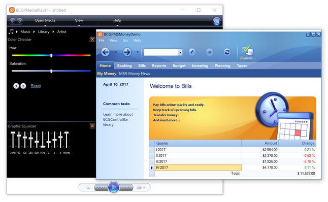
On the picture below, you can see a screenshot taken from the "BCGPMediaPlayer" and "BCGPMSMoneyDemo" examples:
The framework maintains a global object of CBCGPVisualManager class, that by default draws the following GUI elements:
- bar borders (OnDrawBarBorder)
- bar grippers (OnDrawBarGripper)
- button borders (OnDrawButtonBorder)
- caption buttons (OnDrawCaptionButton)
- menu borders (OnDrawMenuBorder)
- separators (OnDrawSeparator)
- fills bar background (OnFillBarBackground)
- fills button interior (OnFillButtonInterior)
- highlights menu items (OnHighlightMenuItem)
Each element is displayed by a separate virtual function.
To implement your own skin, you should perform the following steps:
- Derive your own class from the CBCGPVisualManager class.
- For each GUI element whose appearance you want to customize, override the relevant drawing function.
- The CBCGPVisualManager object is a singleton. When you want to instantiate a visual manager object, you should delete the previous
instance. Use the CBCGPVisualManager::GetInstance static function to get access to the current instance.
The following example shows how to switch between default and custom visual managers:
void CMyApp::SetCustomTheme(int iThemeIndex)
{
    switch (iThemeIndex)
    {
    case OFFICE_2016_CUSTOM_THEME:
        // CMyOffice2016Theme is derived
        // from CBCGPVisualManager2016 class:
        SetVisualTheme(
            BCGP_VISUAL_THEME_OFFICE_2016_COLORFUL,
            RUNTIME_CLASS(CMyOffice2016Theme));
        break;

    case VS_2017_CUSTOM_STYLE:
        // CMyVS2017Theme is derived
        // from CBCGPVisualManagerVS2013 class
        SetVisualTheme(
            BCGP_VISUAL_THEME_VS_2013_BLUE,
            RUNTIME_CLASS(CMyVS2017Theme));
        break;
    }
}
Back to the Developer Area