The Toolbar Editor allows you to easily create and manage application toolbars. You can add toolbar buttons and controls, create and edit toolbar button images
for various color modes, and associate buttons with command IDs.
Toolbar Editor works directly with project resources and modifies *.rc and resource.h files. Also, it adds or modifies some files in the /res folder
(images, *.rc2, and *.xml files); therefore, if you work with a source-controlled project, don't forget to check out the resources first.
The Toolbar Editor application is named BCGToolbarEditor.exe and installed in the <install path>\BCGSoft\BCGControlBarPro\Designers folder.
The corresponding shortcut is added to the "BCGCBPro" application group.
Toolbar Editor supports images in .svg, .bmp, ico and .png formats with up to 32bpp colors; therefore, you can quickly adapt the default toolbar (16 colors)
to a high-quality semi-transparent look.
Description of Toolbar Editor interface.
Menu
- File:
- Open... - opens an existing Visual Studio project (dsp, vcproj, vcxproj).
- Close - closes a project being edited.
- Save - saves a project being edited.
- Exit - closes the Toolbar Editor.
- Edit: allow to edit currently selected toolbar button images or change the selected control (button) type.
- View:
- Toolbars: allows you to show, hide, and customize the application toolbars and and docking windows.
- Status bar: allows you to show or hide the application status bar.
- Application Look: Allows you to specify the application's theme and the appearance of SVG icons in dark themes.
- Help: displays Toolbar Editor version info and this development guide.
Docking Windows
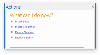
- Actions - displays shortcuts to actions available in the current context. For example, if there is no open project, you can only open
an existing project, or project from the recent list:
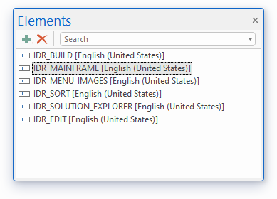
- Elements - displays a list of toolbars available in the project being edited. Use docking pane to add, delete and find toolbars (the
corresponding buttons on the embedded toolbar:
If you click "Add" button the "Add Toolbar" dialog appears:
- ID: specify the new toolbar resource ID.
- Width/Height: specify dimensions of a single image in toolbar's image list.
- Language - allows to create localized resources.
- Properties - displays properties for the currently selected object (toolbar or toolbar button).
The following screenshot illustrates toolbar properties:
- ID - toolbar resource ID
- Images Hot/Cold/Disables - allows to assign existing image list IDs to the toolbar.
- Width/Height - specifies a single image dimension in the toolbar's image list. Changing these properties affects all image lists.
The following screenshot illustrates toolbar button properties:
- Caption (optional) – toolbar button text label.
- ID - toolbar button's command ID.
- Category (optional) – toolbar customization dialog category name where this control should be displayed.
- C++ Class Name (optional) – toolbar button C++ class name (should be derived from the corresponding toolbar button class such as CBCGPToolbarButton or CBCGPToolbarComboBoxButton and should be created with DECLARE_SERIAL and IMPLEMENT_SERIAL).
- Other properties are toolbar control specific (like list of items in the toolbar combo box or prompt in the toolbar edit box).
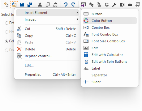
- Toolbox - contains a list of elements, which can be used for toolbar editing:
Click the desired toolbar control, drag it to the toolbar, and drop it at the location where this control should be added.
The controls that you can add are:
- Button – button with the icon and/or text label.
- Separator – separator.
- Color Button – color picker with the dropped-down colors palette.
- Combo Box – combo box (drop-list or drop-down, with the edit control).
- Font Combo Box – font picker with the dropped-down fonts list.
- Font Size Combo Box – font size picker, the drop-down list contains the font sizes.
- Edit – edit box; can be created with the prompt text label.
- Edit Box with Calculator – edit box with drop-down calculator popup.
- Label – static text label.
- Slider – slider (tracking) control; can be created with the zoom buttons and in the progress mode.
- Images - displays a list of images available for the currently selected button (up to 4 images - default, hot, cold, disabled).
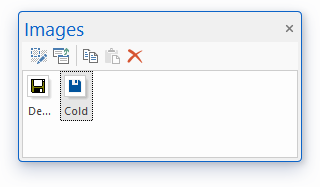
The embedded toolbar allows to edit the selected image bringing up the image editor, import an image from an external file,
copy the selected image to the Clipboard, paste an image from the Clipboard and clear the selected image.
Main View
The Main View displays a toolbar selected in the Elements window. You can edit this toolbar by clicking toolbar buttons.
You can arrange existing buttons using drag&drop.
Right click brings up a context menu with available editing options:
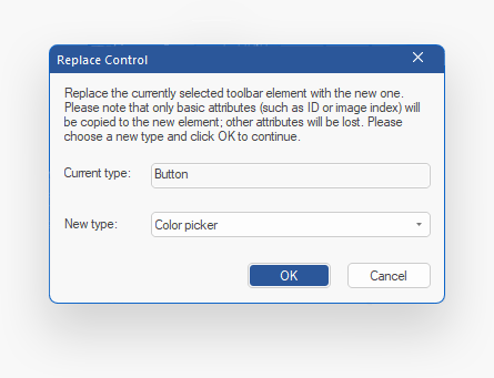
If you need to replace the existing toolbar control with a control of another type (for example, replace the button with the color picker),
please choose the “Replace control…” menu item and change the type in the “Replace Control” dialog:
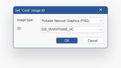
You can define and edit additional image lists with hot, cold and disabled images (each image list is optional). If an image list has not been created,
click the corresponding "Set ID..." button for the desired image list. It brings up a dialog, which allows to define a new image list ID,
or select an existing ID:
When a new image list has been assigned to a toolbar, you can select it for editing by choosing the appropriate radio button:
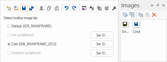
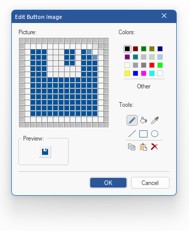
Image Editor
The Image Editor dialog appears when you select "Edit Image" on the Images pane or from the toolbar editor's context menu
on the Main View.
Add New Image
The Add New Image dialog appears when you click "Import Image" button on the embedded toolbar on the Images pane.
The imported image will replace the currently selected image in the image list.
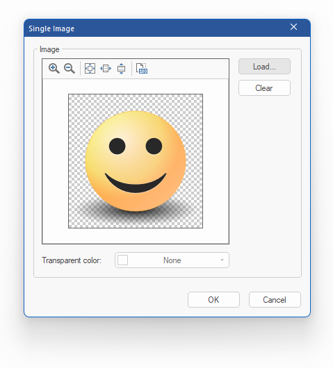
Click the "Load..." button to load an existing file (.svg, .bmp, .ico, and .png images are supported). Click "Clear" button
to clear the image that has been loaded. Select transparent color from the drop-down color picker if the loaded image is not 32bpp.
General Workflow
- Start the application and open an existing Visual Studio project or separate resource file (*.rc).
- To add or delete a toolbar click the appropriate button on the Elements pane toolbar.
- Select a toolbar to be edited -> the default image list appears in the Main View.
- Click "Set ID..." button on the Main View to create additional image lists with hot, cold and disabled images (these image lists are optional).
- Select the desired radio button on the Main View to edit a specific image list.
- Use either Toolbox, or context menu, or Actions pane shortcuts to insert or delete
toolbar buttons or separators. All image lists are updated accordingly.
- Select a toolbar button on the Main View and use drag&drop to change button's position. All image lists are updated accordingly.
- Use Properties pane to assign a command ID to a selected toolbar button (ID
property). If you change Width or/and Height properties, all image lists will be updated.
- Use Images pane to edit images for selected toolbar buttons.
- Save the project and compile the application to see the changes. If you've added new image lists, you may need to specify their IDs in the application code.
Back to the Developer Area