The Designer allows you easily create mock ups for real applications. It takes an existing MFC project as an input and generates an XML
representation of Ribbon elements along with RC files as an Output. When the designer part of the work has been done you just compile the project,
run and see the designed Ribbon control in action.
This guide explains how to take advantage of the Designer tool.
Prerequisites:
- First of all you have to create an MFC or BCGControlBar Pro-based application using the Application Wizard, or select an existing
(MFC or BCGControlBar Pro-based) application.
- The application must be either SDI, or MDI.
- designer supports all Visual Studio projects from Visual Studio 6.0.
Note: if you select a pure MFC project, you'll need to perform some additional steps for migration from MFC to BCGControlBar Pro.
Starting the designer:
Run BCGPRibbonDesigner.exe application (located at your <BCGControlBar Pro Installation Folder>\Designer folder).
It offers you to open an existing project, or open a project from the recent project list. Select the desired project and the environment is ready to work!
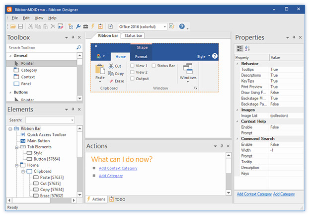
Brief Description of Docking Windows:
-
Toolbox
The Toolbox window contains a list of Ribbon objects that are supported by Ribbon Control and can be dropped on the Ribbon at design time.
-
Elements
The Elements window contains a tree of objects that have been already placed on the Ribbon at the design time.
-
Actions
The Action window lists some possible actions to be performed in the current context.
-
TODO
TODO window contains a list of actions that should be performed with your project in order to successfully build and run it.
-
Properties
Properties window displays a list of properties of currently selected element.
-
Ribbon bar
The Ribbon Control design surface.
-
Status bar
The Status Bar design surface.
Adding a Category:
An usable Ribbon Control must contain at least one category, therefore the first thing you have to do when you start the design process is to add a Category.
To add a new Category select a Category object from the Toolbox, or click the "Add Category" action in the Actions window, or invoke a context
menu clicking on the Ribbon Control's design surface. This action shows up the "Add Category" dialog:
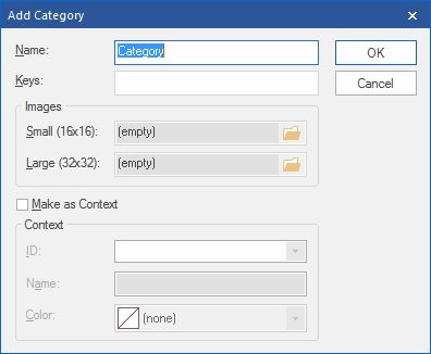
- Name - type the Category name.
- Keys - type the Category keytip.
- Images. Here you have the opportunity to specify small and large images for Ribbon elements, that will be added to the Category. The images can be
loaded from an image list contained in svg, bmp or png file. The Designer breaks an image list to individual images and later you'll be
able to specify an image index for individual Ribbon element.
When a Category has been added, you can start adding Panels.
Adding a Panel:
To add a Panel select a Panel object from the Toolbox, click a link in the Actions window, or invoke a context menu by clicking right mouse
button on the Category's design surface. This action brings the "Add Panel" dialog:
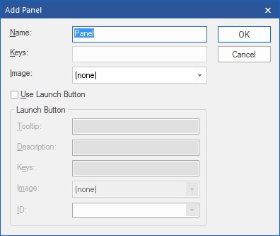
- Name - specifies the new Panel name.
- Keys - specifies the Panel keytips.
- Image - allows to select an image for the Panel. This image is displayed the Panel is placed on QAT.
- Use Launch Button - tick this box if you wish to assign a Launch Button to the Panel.
- Tooltip - Specify the Launch Button tooltip.
- Description - Specify the Launch Button description displayed on the tooltip.
- Keys - Specify the Launch Button keytips.
- Image - Select an image that will be displayed when Launch Button is added on the QAT.
- ID - Select a command ID for the Launch Button.
Now you can add elements to the Panel.
Adding Elements and Setting Properties:
To add a new element to a Panel select the appropriate element in the Toolbox window or invoke a context menu by clicking right mouse button on the Panel's
design surface. The newly added element is selected in the Designer and its properties can be edited in the Properties window. You can define element's
caption, tooltip, tooltip description, keytips, large and small images (if appropriate), width (for combo boxes, edit boxes, slider) and so on.
Element's images can be either selected from image lists specified during the "Add Category" step, or loaded from separate svg, bmp, png or ico file.
Pay attention that the ID property allows you either select the Element's Command ID from a list of existing commands, or specify a new Command ID.
Selecting a New Image and Editing Image Collections:
You can always edit the image collection, associated with current Category and / or replace an element's image at design time.
For this purpose select an Element and drop down combo box associated with the "Image" property:
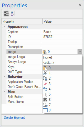
Now you can select a new image from the list, or select <edit...>. This action brings up the "Image Collection" dialog:
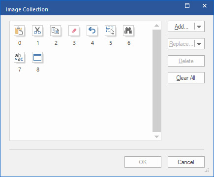
- Now click "Add..." button to add images from a file (bmp, png, ico, svg), or from another Image Collection.
- Click Delete to remove a selected image for the Image Collection.
- Click Clear to remove all images from the Image Collection.
When you have filled up Categories and Panels, you can set up the initial state of QAT, e.g. select elements, that will appear on the QAT at the application start up.
Setting up QAT:
Click the QAT arrow on the Designer surface:

Now you can edit QAT properties in the Properties window. The Position property specifies the position of QAT on the application start up -
below or above the Ribbon Control. Click on the Items property brings the "Edit QAT Items" dialog:
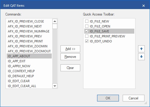
You can look through the list of existing Commands and add them to the Quick Access Toolbar. A check box displayed with each command
in the Quick Access Toolbar
list indicates whether the command is visible on the QAT, or available from the QAT's drop down button.
Note, that commands do not show up on the QAT in Designer.
When you have completed the design process, or just want to see the designed Ribbon in action, save the project and perform a
couple of steps to setup the application Ribbon Control.
Verify Keys:
Click the "Edit | Verify Keys..." menu item, and you will see the following dialog:
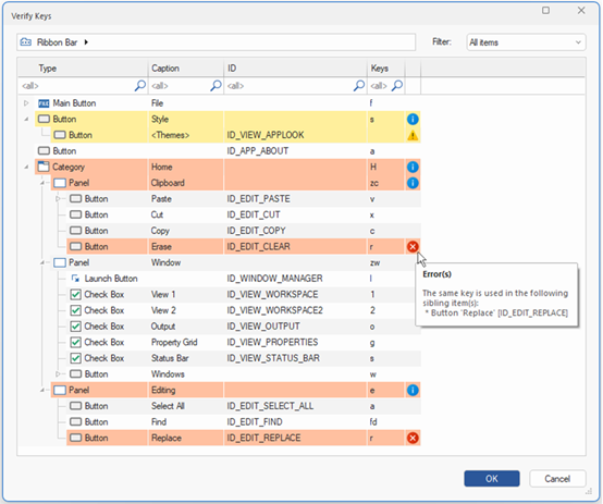
In this dialog, you will see the following possible issues with the keys assigned to the Ribbon controls:
-
The control doesn’t have any key assigned to it. This problem is indicated by the warning icon.
-
The same key is used in two or more sibling items. Indicated by the error icon.
-
One or more subitems have a problem with keys. Please expand the group to see the problem(s). Indicated by the information icon.
You can resolve the issue by changing the value of the key in the "Keys" column.
You can filter out the viewing scope by specifying the ribbon control’s location in the top-aligned breadcrumb and the key state in the “Filter” combo box located at the top-right of the dialog.
When the problems are resolved, please click the OK button, and corrected keys will be assigned to the ribbon controls.
Modifying the Application:
The Designer creates an XML representation of Ribbon Control layout, generates png or svg files with Image Collections, creates an *.rc2 with
references to the generated files, and adds definitions of Command IDs created at design time to resource.h file. Also, when the project is being saved,
you are offered an option to add a reference to rc2 file to the application's *.rc file.
All Designer's output is located in the res\BCGSoft_ribbon folder.
Important! You've to add all files from the res\BCGSoft_ribbon folder to your Visual C++ project!
If you're working with BCGControlBar Pro-based project, perform the following steps to connect your application with newly designed Ribbon control:
-
Declare the Ribbon Control object in CMainFrame class:
CBCGPRibbonBar m_wndRibbonBar;
-
In CMainFrame::OnCreate create and initialize the Ribbon Control:
if (!m_wndRibbonBar.Create(this))
{
    return -1;
}

if (!m_wndRibbonBar.LoadFromXML(_T("IDR_BCGP_RIBBON_XML")))
{
    return -1;
}
If you're working with pure MFC application, please follow this link to learn how to migrate from MFC to BCGControlBar Pro:
https://support.bcgsoft.com/KB/View/31-how-can-i-switch-my-existing-mfc-application-to-bcgcontrolbar-library
Back to the Developer Area