-
Introduction
-
Classes
-
How to add ribbon control to your application
-
Question and answers
Introduction
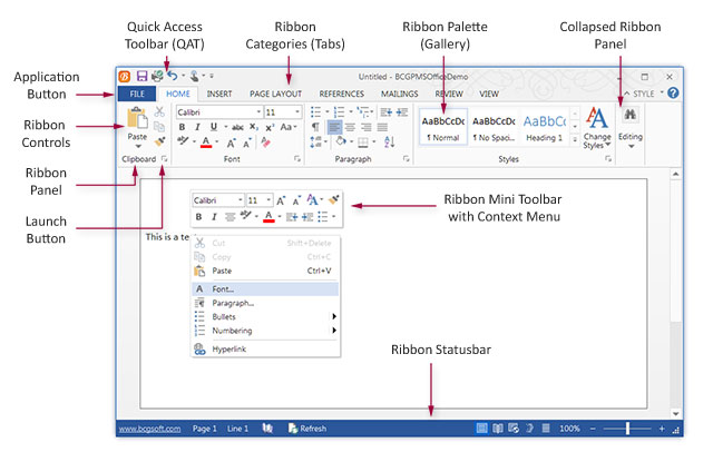
"Ribbon" control was introduced by Microsoft in Office 2007. It's not just a new control; it's a new user interface ideology. Ribbon control
replaces traditional toolbars and menus with tabbed groups (Categories). Each group is logically split into Panels, and each panel may contain various controls
and command buttons. In addition, Ribbon control provides a smart layout, maximally utilizing the available space. For example, if a Panel has been stretched
and has no place to display all available controls, it becomes a menu button that can display sub-items on a popup menu.
Another excellent addition is "Floaty" (a mini toolbar). Floaty is a semi-transparent toolbar appearing right near the cursor and containing "hot"
commands relevant for the current context.
The customizable "Quick Access Toolbar" and "Main" (application) button allow instant access to the most important and extensively used commands.
The BCGControlBar Library provides an effortless and efficient way to add this technology to your applications.
Classes
CBCGPRibbonBar implements the main class, which is the Ribbon control itself. It behaves as a "static" (non-floating) control bar and
can be docked at the top of the frame. In fact, the same Ribbon Bar can be used to implement an Office 2007-2024-style status bar or any other control
that hosts Ribbon Categories (CBCGPRibbonCategory). A Ribbon Category is a logical entity. The visual representation of the Category is a Ribbon Tab
(CBCGPRibbonTab). A Category contains (and the Tab displays) a group of Ribbon Panels. Each Ribbon Panel contains one or more Ribbon Controls
(CBCBPBaseRibbonElement-derived objects), as outlined in the following picture:
Most of the Ribbon Controls should have two images: small (16x16) and large (32x32). In some cases, when a Ribbon Control needs to display an image (which occurs if the control has been stretched to a size that allows for image display), but no image has been specified, the library will use a default internal image.
Each Category is assigned its own image list. You can specify an
index in this image list for each Control that belongs to a Category.
CBCGPRibbonButton implements a command button object. Ribbon Buttons can be
arranged in Groups (CBCGPRibbonButtonsGroup). Each Group has a first and last
control. All Group controls are surrounded by a group border.
A special kind of Group is the Quick Access Toolbar (CBCGPQuickAccessToolbar).
Usually, it contains the most important and frequently used commands. The user can
customize this toolbar.
The Ribbon Main (application) Button (CBCGPRibbonMainButton) is a special button located in
the top left corner of the application window and displays a menu, which usually
contains "File" commands like Open, Save, and Exit.
The Ribbon Launch Button (CBCGPRibbonLaunchButton) is a small button located at
the bottom-right corner of the Ribbon Panel. This button can be associated with an
additional panel command (for example, it can display a dialog with some options
common to the Panel).
The Ribbon Color Button (CBCGPRibbonColorButton) is a special Ribbon Control
(button) that displays a color picker. It extends the Ribbon Button and allows
setting additional options for the color picker.
How to add ribbon control to your application
-
Open mainfrm.h, remove
CBCGPMenuBar m_wndMenuBar and CBCGPToolBar m_wndToolBar.
-
Add definitions for the
Ribbon Bar and Ribbon Main Button:
CBCGPRibbonBar m_wndRibbonBar;
CBCGPRibbonMainButton m_MainButton;
-
Add definition for the panels image list:
CBCGPToolBarImages m_PanelIcons;
-
Open MainFrm.cpp and remove
everything related to m_wndMenuBar and m_wndToolBar.
-
Add to the resources a bitmap
for the Ribbon Main Button (IDB_MAIN). Use a bitmap 26x26 pixels. Add a
bitmap for the image list of small icons (16 pixels in height) and a bitmap for
the image list of large icons (32 pixels in height). Name them IDB_SMALL_ICONS and
IDB_LARGE_ICONS respectively.
-
Create Ribbon Bar in CMainFrame::OnCreate:
m_wndRibbonBar.Create(this);
-
Initialize and set the Main (Application) Ribbon Button:
m_MainButton.SetMenu(IDR_FILE_MENU);
m_MainButton.SetImage(IDB_MAIN);
m_MainButton.SetToolTipText(_T("File"));
m_wndRibbonBar.SetMainButton(
    &m_MainButton, CSize(45, 45));
-
Initialize and load the image list of panel icons:
m_PanelIcons.SetImageSize(CSize(16, 16));
m_PanelIcons.Load(IDB_PANEL_ICONS);
-
Add the first category:
CBCGPRibbonCategory* pCategory =
    m_wndRibbonBar.AddCategory(
	    _T("&Write"), // Category name
        // Small images (16 x 16)
	    IDB_WRITE,
        // Large images (32 x 32)
	    IDB_WRITE_LARGE);
-
Add the first Panel to the category:
CBCGPRibbonPanel* pPanel =
    pCategory->AddPanel(
	    _T("Clipboard"), // Panel name
	m_PanelIcons.ExtractIcon(0)); // Icon
-
Now, we need to add ribbon controls (buttons) to the panel:
// Create the first button to Panel
// ("Paste"):
// The third parameter (-1) tells that
// this button does not have
// a small icon.
// Therefore the "Paste" button will be
// always displayed with large icon.
CBCGPRibbonButton* pPasteButton =
    new CBCGPRibbonButton(
        ID_EDIT_PASTE,
        _T("Paste"), -1, 0);

// Associate a popup menu with
// the "Paste" button:
pPasteButton->SetMenu(IDR_CONTEXT_MENU);

// Add other buttons to the panel.
// These buttons have small icons only:
pPanel->Add(new CBCGPRibbonButton(
    ID_EDIT_CUT, _T("Cut"), 1));
pPanel->Add(new CBCGPRibbonButton(
    ID_EDIT_COPY, _T("Copy"), 2));
pPanel->Add(new CBCGPRibbonButton(
    ID_EDIT_PAINT, _T("Paint"), 9));
In the way outlined above, you can set up the ribbon bars. Below, you can read a Q&A on how to take advantage of some more advanced features.
Questions and Answers
Q. How do I add a toolbar combo box button to a panel?
A. Use the CBCGPRibbonComboBox control:
pPanel->Add(
    new CBCGPRibbonComboBox(ID_MY_COMBO));
Q. How do I add a Quick Launch Button?
A. Let's say the ID_APP_ABOUT command displays the "About" dialog. To enable the Quick Launch Button for a panel, do the following:
pPanel->EnableLaunchButton(ID_APP_ABOUT);
Q. How do I add to a Pane several groups of buttons from a toolbar defined in resources?
A. Create a toolbar in the resource editor (IDR_MAINFRAME). Add an image list for this toolbar (IDB_MAINFRAME256).
pPanel->AddToolBar(
    IDR_MAINFRAME, IDB_MAINFRAME256);
Q. How do I add a group of buttons to a Panel on the fly?
A. Create a CBCGPRibbonButtonsGroup object, add buttons to it, and add this object to the Panel:
// 19, 20 - indexes of button images
// in the Category's image list.
CBCGPRibbonButtonsGroup* pButtonsList =
    new CBCGPRibbonButtonsGroup;
pButtonsList->AddButton(
    new CBCGPRibbonButton(
        ID_FORMAT_GROWFONT,
        _T("Grow font"), 19));
pButtonsList->AddButton(
    new CBCGPRibbonButton(
        ID_FORMAT_SHRINKFONT,
        _T("Shrink Font"), 20));

pPanel->Add(pButtonsList);
Q. How do I add a custom button to a group of buttons created from a toolbar?
A. When a toolbar has been added to a Panel, you need to replace the "regular" button with the custom button.
Because Ribbon Control copies and creates buttons on the fly (for example, when there is no room to display a button and this button
should be placed on a popup palette, Ribbon Control creates a copy of the button), you need to specify the runtime class of the custom button:
// Load and add toolbar with standard
// buttons. This toolbar should display a
// custom color button with id ID_CHAR_COLOR
pPanel->AddToolBar(
    IDR_MAINFRAME,
    IDB_MAINFRAME256);

// SetElementRTCByID sets runtime class and
// returns a pointer to the newly created
// custom button, which can be set up
// immediately:
CBCGPRibbonColorButton* pColorButton =
  (CBCGPRibbonColorButton*)
    pPanel->SetElementRTCByID(
      ID_CHAR_COLOR,
      RUNTIME_CLASS(
        CBCGPRibbonColorButton));
pColorButton->EnableAutomaticButton(
    _T("Automatic"), RGB(0, 0, 0));
Q. How do I set up the Quick Access Toolbar?
A. Just fill out the list of "quick access" commands and call CBCGPRibbonBar::SetQuickAccessCommands:
CList<UINT, UINT> lst;

lst.AddTail(ID_FILE_SAVE);
lst.AddTail(ID_EDIT_COPY);
lst.AddTail(ID_FILE_PRINT);

m_wndRibbonBar.SetQuickAccessCommands(lst);
Q. How do I add controls to the right side of tabs?
A. The following code adds the "About" button to the right side of tabs:
m_wndRibbonBar.AddToTabs(
    new CBCGPRibbonButton(
        ID_APP_ABOUT,
        _T(""),
        m_icons.ExtractIcon(5)));
Back to the Developer Area