Excel like Grid Cells Conditional Formatting
 BCGControlBar Pro (MFC)
BCGSuite (MFC)
 BCGControlBar for .NET
The following formatting types are supported by the grid control:
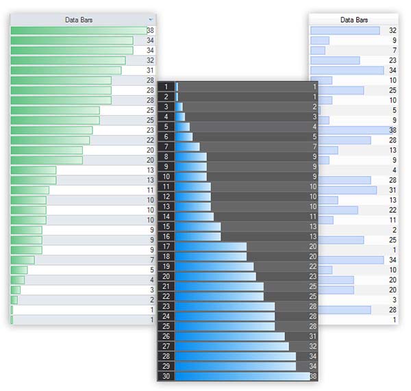
- Data Bars. The length of the data bar represents the value in the cell. Call 'CBCGPGridItem::SetDataBar' method to specify the data bar length (in percentage). By default, the data bars appearance is provided by the Grid color theme, but you can change it by calling 'CBCGPGridCtrl::SetCustomDataBarColors' method. In addition, you can customize Data Bars appearance in your own visual manager.
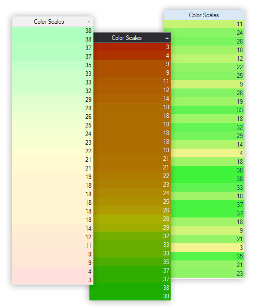
- Color Scales. Displays 2 or 3 color gradients in a range of cells. The shade of the color represents the value in the cell. Call 'CBCGPGridItem::SetDataColorScale' method to specify the color shade (in percentage). By default, the colors are provided by the Grid color theme, but you can customize them.
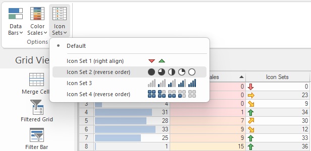
- Icon Sets. Displays an icon from the icon set in each cell. Each icon represents the value in the cell. Call 'CBCGPGridItem::SetDataIcon' method to specify the icon (in percentage). By default, the Grid displays icons from the default set (5 arrows), but you can specify the icons set by calling 'CBCGPGridCtrl::SetCustomDataIconSet' method.
Data Bars:
Color Scales:
Icon Sets: